Why SlideShow (carousel) is a popular design element? Extended features
Table of Contents
Impress your visitors with an awesome SlideShow!
First, let us clarify what is a slideshow (carousel). SlideShow is a dynamic design element you can use to show multiple images on one page. It will show these images in a previously set speed and order. Previously, you would need to know some HTML to create one, now there are lot of tools which can help you to build one easily.
Slideshows are one of the most popular visual display styles in web design today. You can find them anywhere. Probably you may not even notice them. However, there is a big chance you stumble upon slideshows every day while you are browsing your favorite content online.DragDropr SlideShow extended features:
- “Viewport control” – Now you can control what you want to show your users depending on their screen size (Mobile, Table, Laptop, etc.)
- “Slide Count” Set the number of slides you want to show on specific screen size
- “Center Mode” Center the slides you want to show in every viewport
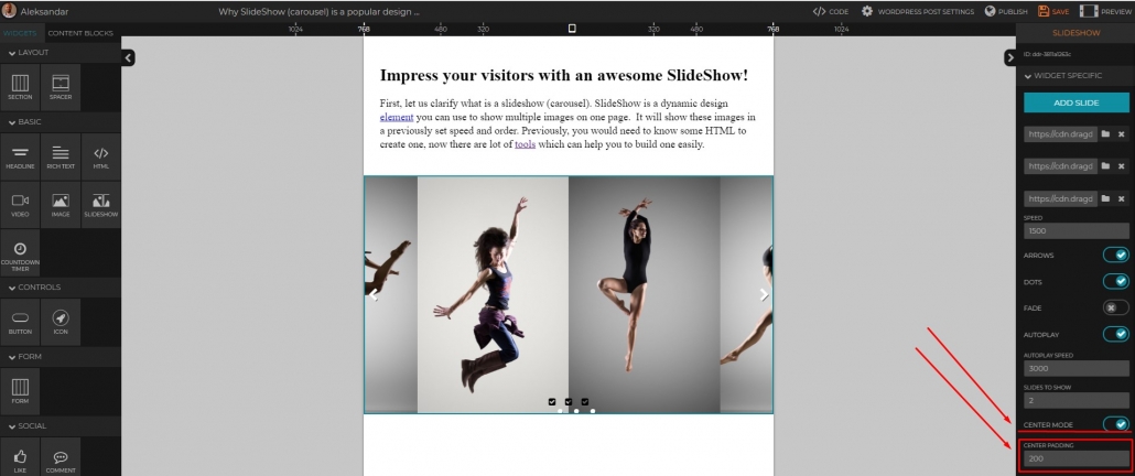
- “Center Padding” Extends the “Center Mode” feature by giving you the option to show the next and previous slide
Why are slideshows so popular?
The strongest reason for the popularity of carousel is the dynamic feel they make on any web page. With them, you create that dynamic through the motion of images on the screen.
Additionally, with them, you’ll be able to display more than one image. There is no reason to reserve that sweet spot on your page for one image. Because, you can show a few great graphics you have ( E.G. products, different company divisions, or a great story! etc)
Are there any drawbacks with using SlideShows?
Nothing is perfect. Or better put, one thing is not perfect for everyone. A slideshow can be a perfect element for your site, but for other (or other purposes) it may not.
People argue that use of SlideShows may distract your visitors. To get them out of focus, especially when using on specific pages, like Landing Pages. Another issue could be overdoing it. You can get carried away and add to many images. This could ultimately lover your page time and hurt your SEO.
Bottom line is, it all depends. It depends on your personal preference, on your page mission, your business, and overall site design.
Good and Bad Slideshow practices
Good’s
Always tell a story
Don’t just randomly throw some images to your slide, or it will lose its point. Create a flow that will convey the message you want to transfer to your audience.
Provide clear navigation
Whether your slideshow is automatic or manual, always give your visitors a way to control it. As they would probably want to get back or forward to a certain image/content.
Control your Slideshow on different screen sizes
Back in 2015 responsivity could have been an option. In 2019 it’s a must. You need to plan and control what you show to your user’s different screen sizes. Because the experience of watching the same slideshow on a Mobile device is totally different from watching it on a Laptop.
Bad’s
Overdoing it
Too many images and your slideshow will lose its point. 3-5 slides are perfect.
Few Slideshows per page
This would be a total design fail 🙂 Period.
Animations
A slideshow will provide all the necessary motion and dynamic to your page. Adding more to it can mess the overall design of your page.
How to create a Sliedeshow?
With DragDropr, you’ll create your Slideshow easy. It all comes down to a couple of clicks and drags and drops 🙂
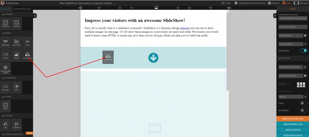
- First, drag a Slideshow widget to your canvas
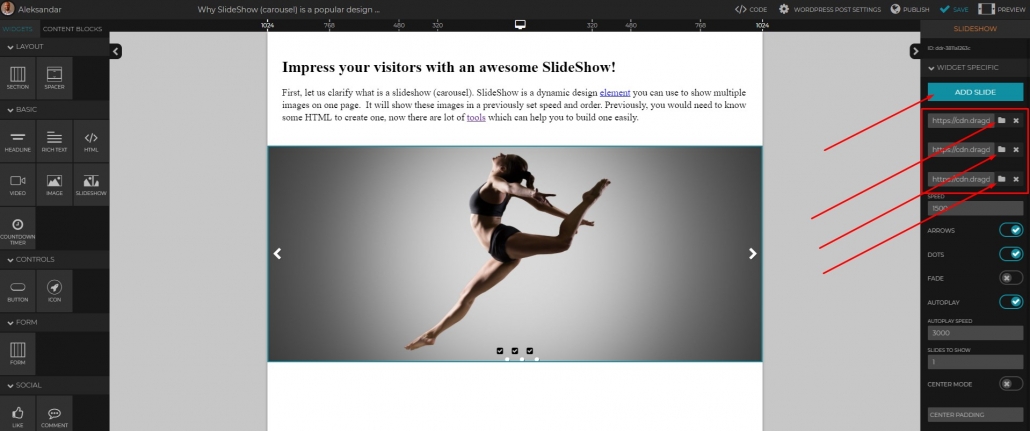
- Click “Add Slide” to add as many image slide slots you need. Then upload images (or add their URL’s) to these slots
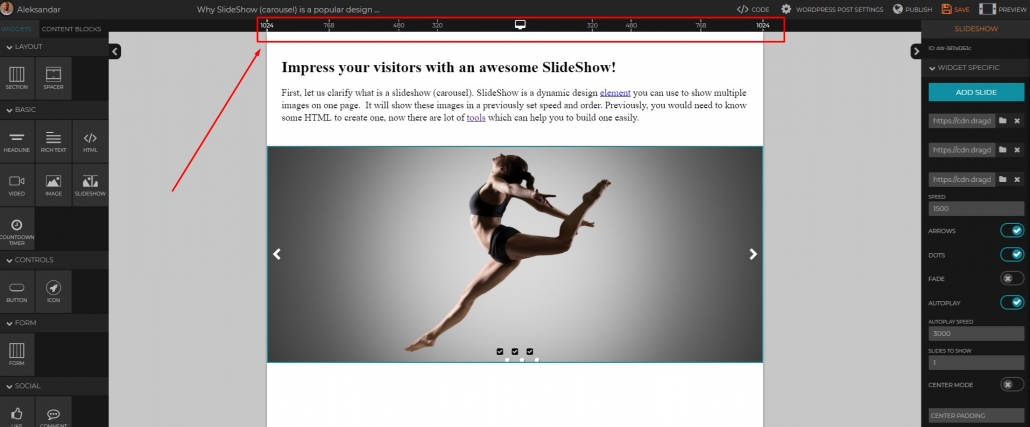
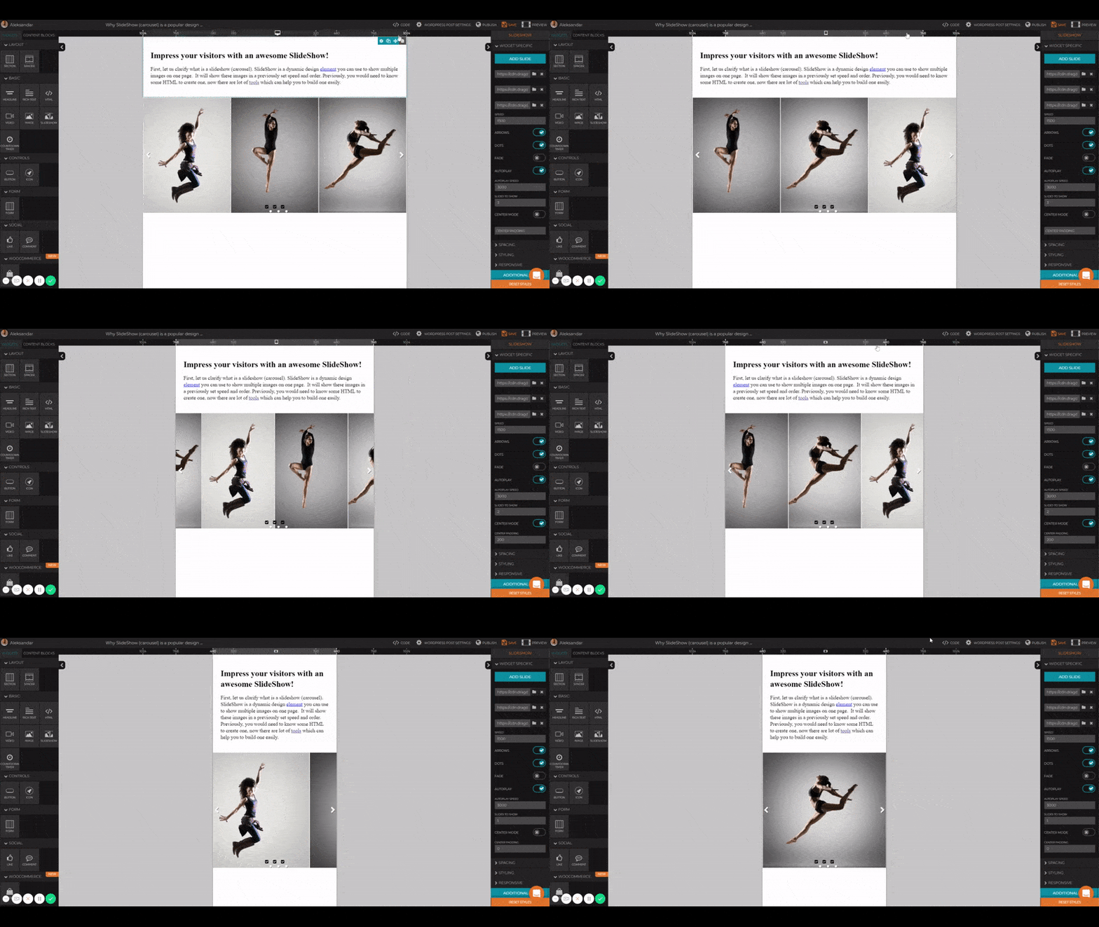
- Select the viewport size. By doing this you are controlling what will your users see on that specific screen size. Here we’re selecting 1024px
- Set the Autoplay speed and the number of slides you want to show on that screen size. (1024 is a typical Laptop, 320 is Mobile, etc)
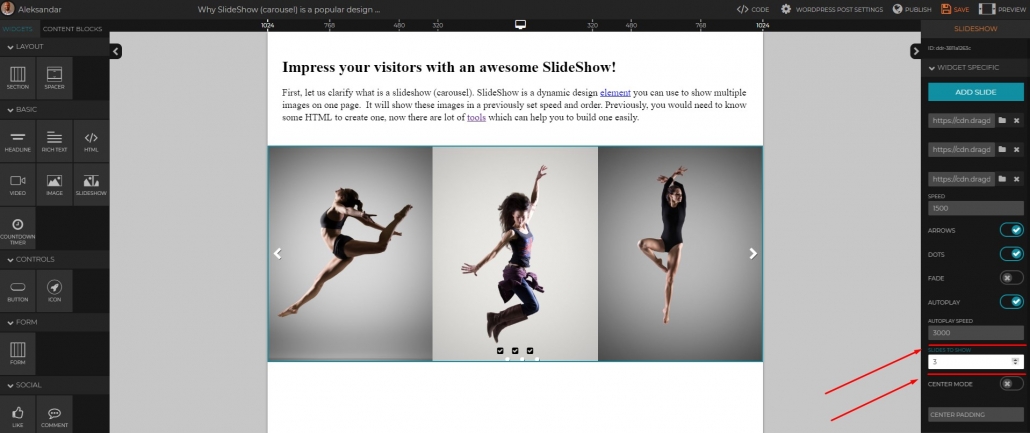
- Set other Slideshow options, like navigation Arrows, Autoplay, etc.
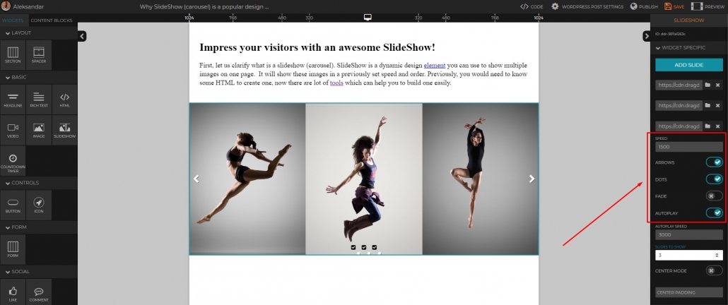
- Now, move on to another viewport screen size. Notice that we are selecting 768 size and adding 2 slides here. (lowering down from 3 slides)
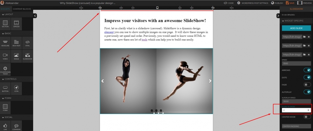
- We can also add some central padding here. Let’s put 200px. This way we will show the small part of the next/previous slide.
- If you want, you can always further customize your SlideShow by adding Additional CSS. Just click on Additional CSS button
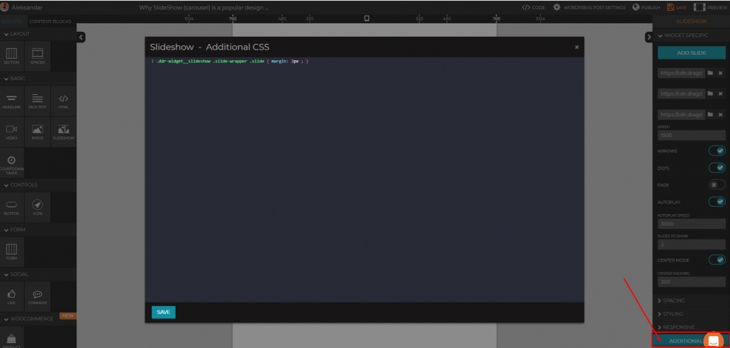
- By adding this simple code: .ddr-widget__slideshow .slide-wrapper .slide { margin: 1px ; } , I’ve created small margins between images, pretty cool right? 🙂 P.S. You can increesse/decresse your margins by just changing the 1px number
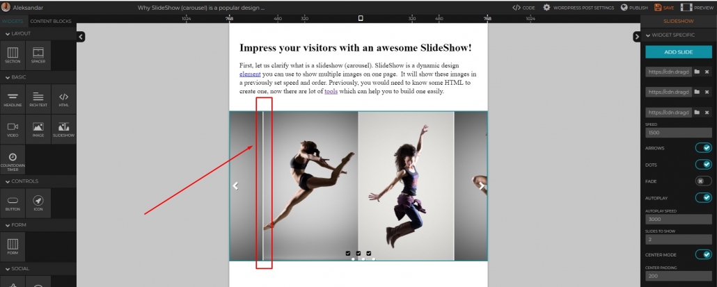
- And here is the final look :
What other features would you like to see in our SliedeShow widget? Just drop us a line here.
DragDorp is the only editor universal to any CMS – Magento, Shopify, Lightspeed, WordPress, and others.
It can be used with any HTML editor to help you build pages visually.
It comes with 75+ ready Landing page templates you can use on any CMS!
Try it now for free, register here and publish your slideshow today:)


Leave a Reply
Want to join the discussion?Feel free to contribute!