Boost Conversion with Landing Pages like Never Before
Have you ever cared about the front-line view of your online store? I am talking about the landing pages; those when created right gives your business a fair chance to generate leads. However, we have already surpassed the era when creating a blog or newsletter record was enough to get you leads.
I am sure you must have encountered a plethora of advice, suggestions, and recommendations for business websites featuring how to generate leads or expand your customer base, secure loyal followers, and the list goes on. Now I completely understand the joy of having a horde of fans, loyal customers who keep on motivating, inspiring you by giving you constant feedback, and makes you keep going towards success. But having visitors alone won’t be much of help in making your website profitable. Instead of simply generating an adequate amount of traffic, you must focus on converting your visitors to buyers.
Landing pages have become pretty much in vogue! And believe it or not, they are considered as one of the best online marketing tools to think upon when it comes to collecting data effectively for your business. The main objective of creating a landing page is to collect bids and convert them into customers. Irrespective of the size of your business, I firmly believe that landing pages are considered as one of the most excellent tools to create as well as sustain potential customers in the long run. But it still boils down to a question, how to create a landing page that works wonders?
Types of Landing Pages
- The click-through landing Page
- The lead generation landing Page
It is the latter that interests us today- The lead generation landing page.
Unlike the click-through landing page, this page acts as a warm-up stage created before action is about to take place (selling a product or service). The lead generation landing page is all about collecting personal information and establishing relevant contact points to create as many leads or prospects for your business. Here you get a fair chance to maximize the interactions between your visitors and your page to establish contact.
Collecting information such as first name and the last name, email address, telephone number becomes mandatory. Let’s delve into how to generate leads on your landing page.
#1 Think upon your design
Can a rough design inspire confidence? Certainly not! To generate better leads, you must start working on your landing page design. In general, terms, make sure that your design is clear and understandable for everyone. To come up with an impactful design, you need to harmonize your theme’s colors, clearly differentiate the titles of your paragraphs, and play on shapes and symmetry. Also, don’t forget to let your text breathe to make things easy to read for your customers.
Furthermore, creating a sense of urgency can help several people in making quick decisions. Try building a little pressure by revealing visitors that there is a few spots left hurry! Apart from this, you can use a countdown timer. And make it so loud and clear that the only way out is to grab the item.
#2 Fine-Tune Your Customer Service
Customers often talk themselves out of making purchases in the case; they have any questions or concerns. So to prevent your potential buyers from throwing in the towel, you need to gain their trust and build their confidence. For the best results, you can add a list of frequently added questions or FAQs to your landing page. Make sure you create such a page that precisely addresses all the worries that you know can block your visitor’s ability to say “YES.”
For example- price, exceptional features- why your product is better than others, why you have the authority to offer your service, how the product turns out to be a convenient option for you, return, and cancellation policy, and the list goes on.
Also, you can add a live chat feature option where you have actual representatives solving crucial cases of your valued customers. I feel live chat could be the turning point of your website. The concept simply emphasizes on helping the prospect right before they abandon their purchase. By doing this, you certainly increase the chances of them becoming your customers from a visitor.
#3 Enhance your calls to action
Last but certainly not the least, call to action is one such thing that needs to be given an adequate amount of attention, especially when you are working on your landing page. Many actions and leave a huge impact, such as subscribe to your newsletter, intuitive registration form, free trial, buying a service or product, reserving a service, asking for a callback.
Also, look out for your forms. I mean to make the form stand out from the rest of the page, make use of attractive colors, give a clear and interesting value proposition.
A few tips to take into account:
-
- Only ask for the minimum
- Use buttons and checkboxes
- Focus on the key benefits
- Optimize for mobiles
Best Landing Page Examples to Look Upon
- Amazon

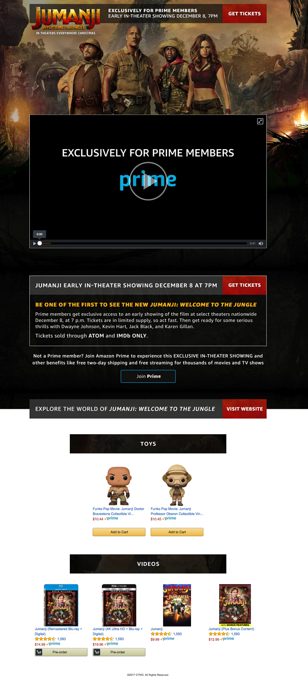
You wondered what works here? They place the call-to-action right at the top of the page so that it can’t be missed. They use a video to humanize the offer and explain their value more dynamically. The messaging uses exclusivity and incentives to encourage conversion. It also speaks directly to Prime users. The page ends by funneling visitors to related products.
- Uber

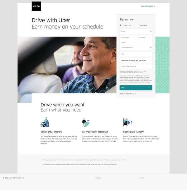
They have included a headline that speaks to a common user pain point- work schedule flexibility. The form is placed high up on the page to avoid getting missed and also allowing visitors to convert right away if they wish. The page incorporates a clear and concise copy. It highlights the three biggest reasons to convert. Make use of a big vision of a friendly, relatable person.
- Salesforce

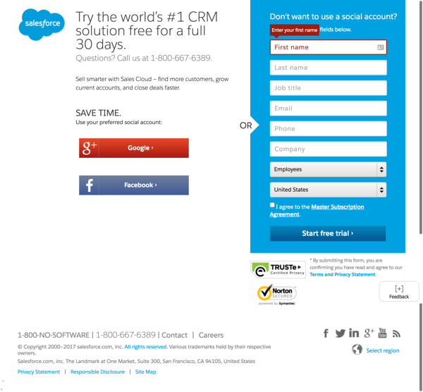
How to get things right?
- Short and sweet with content
- Makes offer clear in the value proposition
- Incorporates social proof including Norton Security
- Copy like “World’s #1 CRM”
- Capitalizes on social login to simplify conversion

Author Bio:
H.P Morgan working as IT Consultant at www.tatvasoft.com.au, a custom software development in Australia. He is having seven years of experience in a technological domain and helps the organization of all shapes. He loves to travel to spontaneous places.


Leave a Reply
Want to join the discussion?Feel free to contribute!