How To Optimize Post-Click Landing Pages
Table of Contents
Let me start with something interesting.
Most visitors aren’t ready to buy even if they’re on a product page. The study I linked to offers interesting insights on how people behave on eCommerce sites.
The statistics may disappoint you. Even call into question the merits of selling online.
Visitors are likely to bounce from product pages. It doesn’t matter how strong the intent is. It doesn’t matter if they landed from search engines, email, social links or directly. They can and will defer purchase to a later time.
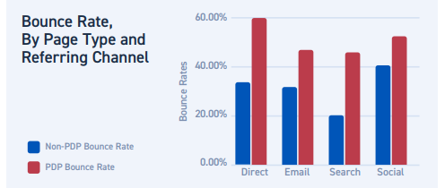
Can we quantify the reasons behind this? Once people decide on a product and click through why do they tend to lose interest? Is there anything in our power to stop this from happening?
Turns out there’s on page optimization can help. Specifically, by optimizing post-click landing pages, you can improve conversions.
What is post-click optimization?
A post-click landing page serves a specific purpose.
Post-click optimization refers to optimizing the landing pages that appear after the visitor has clicked on to an ad or a referral link or social media page etc.
For this article let’s stick with post click landing pages that appear after clicking on ads.
For optimizing these pages, every ad should tie to a relevant landing page.
These pages are created with the intent to convince visitors to take an action- say sign up, complete purchase or get a download.
These pages serve a highly targeted traffic. So, won’t it be better to highlight a single message that stands out? A specific goal? With a single-minded focus you increase conversions and make more money.
The page’s purpose is to make the visitor take a specific action. It’s in your best interest to make it targeted.
Do Conversions Really Improve
Hubspot’s research report shows that brands that use around 40 or higher post-click landing pages tend to get 120% more number of leads. This is compared to companies using less than 5 post click landing pages.
Customers require personalized attention. And such landing pages egg them closer towards a conversion. Along with explaining the best practices I will share post-click landing page examples to inspire your next design. A post-click landing page is different from your site. It’s different from all other pages on your site. And hence it should look and behave differently than what normal pages do. To get better insights on landing page conversions do an analytics audit.
Eliminate Site Navigation
Since a post click landing page is isolated from your website you’d do well to remove any distractions in the path to conversions.
It includes any other click-through opportunities aside from the main CTA. Additional links may seem harmless. What’s wrong with that tiny Facebook page button or Twitter follow?
But they are all preventing your visitors from converting and giving him ample opportunities to fly away without clicking on your CTA.
If the goal is a click on the CTA, why waste it away with needless links?
You can prevent your landing pages meeting with the same tragic fate. With post click optimization you get a chance to convert people at a higher rate.
In the examples below, you’ll see most landing pages without any navigation. That optimizes user experience.
Then go through these steps.
Maintain Message Match
Here’s an example of an ad.

Here’s the landing page you get to after clicking on the ad.
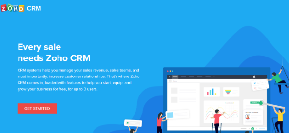
I like it. The landing page matches the message on the ad to the landing page copy. The imagery, the copy and everything else is in tune with the goals of the ad. And someone who clicks through will more than likely go through all the steps involved.
The page is message matched with the post click experience optimized to perfection.
The expectations built via the ad gets fulfilment here. The landing page doesn’t have any navigation clicks so that visitors’ attention stays with the landing page.
Maintain An Attention Ratio Of 1:1
Attention ratio is simply put the number of items that can be clicked on the landing page. It refers to the number of actions a person can carry out on a page.
If you have too many clickable items the conversion ratio skews towards all the additional landing page element the visitor has to pay attention to.
Here’s an example. Look at the landing page. There are no clickable elements save the CTA.
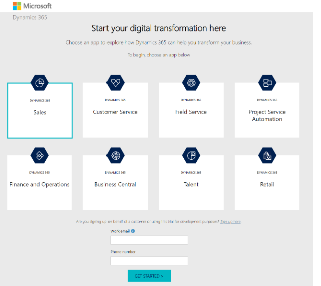
The logo isn’t linked. Once again there’s no navigation menu. The landing page elements all promote the offer. Clicking the different items on the page just leads you to sign up form where you can enter work email and phone number. When you target the right audience you should eliminate anything and everything that takes the visitor attention of the page. The audience remains engaged on the landing page and links therein.
Use Ample White Space
White space is also called negative space and is part of the web page design that doesn’t have anything. It’s empty. White space need not be white.
Its purpose is to create a separation from the rest of the elements on the page.
Finally, it promotes a visual hierarchy calling the eye to see the most important aspects of a landing page.
With the right amount of white space a visitor tunes his attention to the most important elements on a page.
Here’s what I am talking about. For Visme, everything else on the page relegates to the background when compared to the call to action.
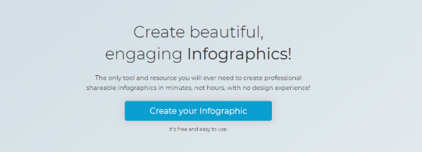
With white space, you’re giving ample breathing room to your calls to action, to the central image. You’re telling them, “hey this is important” and highlighting the element from the rest of the page. With the distinct blue color and big font, the call to action stands out.
It builds a visual hierarchy that tells people the story of your brand.
Conclusion
A post-click landing page serves a specific purpose. Keep your branding on spot and eliminate any distractions that may force visitors to lose attention.
This way you will get more conversions.
Author bio: George is a freelance writer who works at Kamayo.


Leave a Reply
Want to join the discussion?Feel free to contribute!