Top Web Design Trends in 2019
Table of Contents
Design trends have always been an area of great concern for designers. On the one hand, going with what people like goes against creativity. After all, creativity means not following what everyone else is doing, right?
On the other hand, knowing the prevailing design trends are essentially the job of modern designers. That is because websites need to be designed with the user in mind as they are the most important aspect of a business. When it comes to modern web design, the audience should always be at the forefront – and trends are just a product of their choices.
Here are a few of the prevailing web design trends you should look out for in 2019.
1. Bringing back the serif
Serifs seemed to go through a rough patch over the past couple of years as various brands opted to switch to sans serif fonts. However, sans serif is still king when it comes to web content. After all, the general rule is that serifs are for print and sans serifs are for screen – but not in 2019.
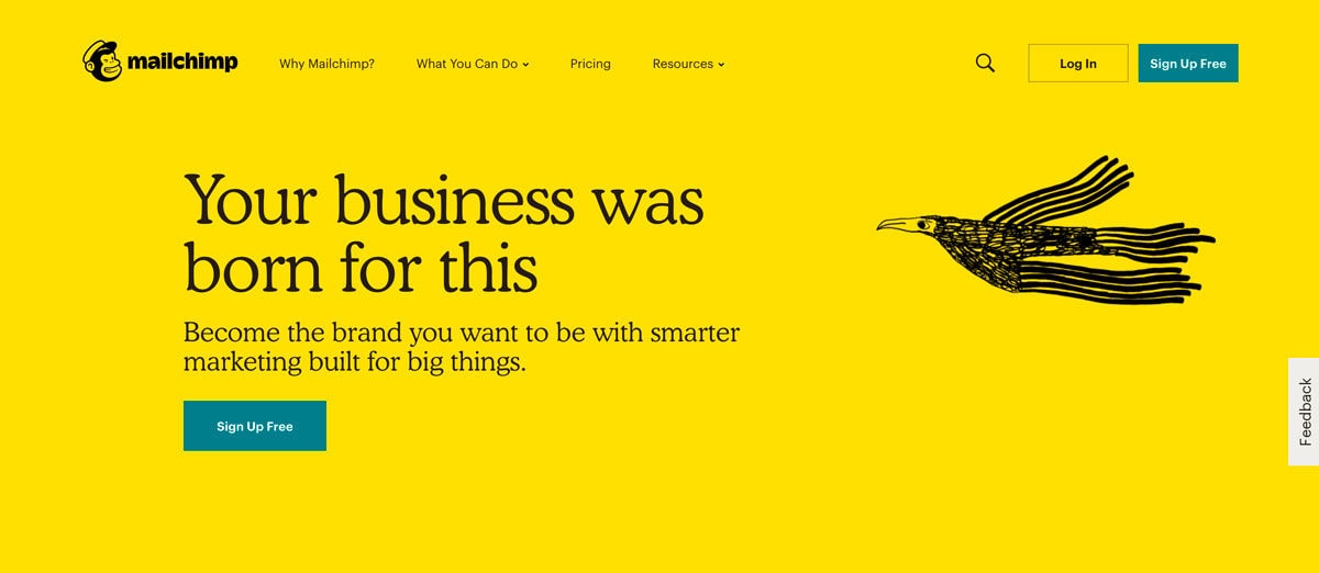
Sans serif fonts offer clean, fresh readability. They are still the go-to fonts for long-form web copy and that’s understandable. But brands are now turning to serifs for other aspects of the design such as headers, callouts, or other areas that need highlighting. That’s understandable considering designers created serifs to be decorative, making them a perfect choice to provide emphasis to certain elements.
This created a new trend in web design where designers are now bringing back vintage styles in their design. Take a look at MailChimp, for example, who has adopted a vintage style for their cheerful style of branding.

via MailChimp
2. The upgraded flat design – pseudo 3D
Flat designs rose to popularity as an alternative to the then popular skeuomorphic style of design of the 2000s. It introduced a new concept to design and delivered a fresh, minimalist style. But just as brands were dedicating themselves to the flat style, 3D has started to make its way again to the fold.
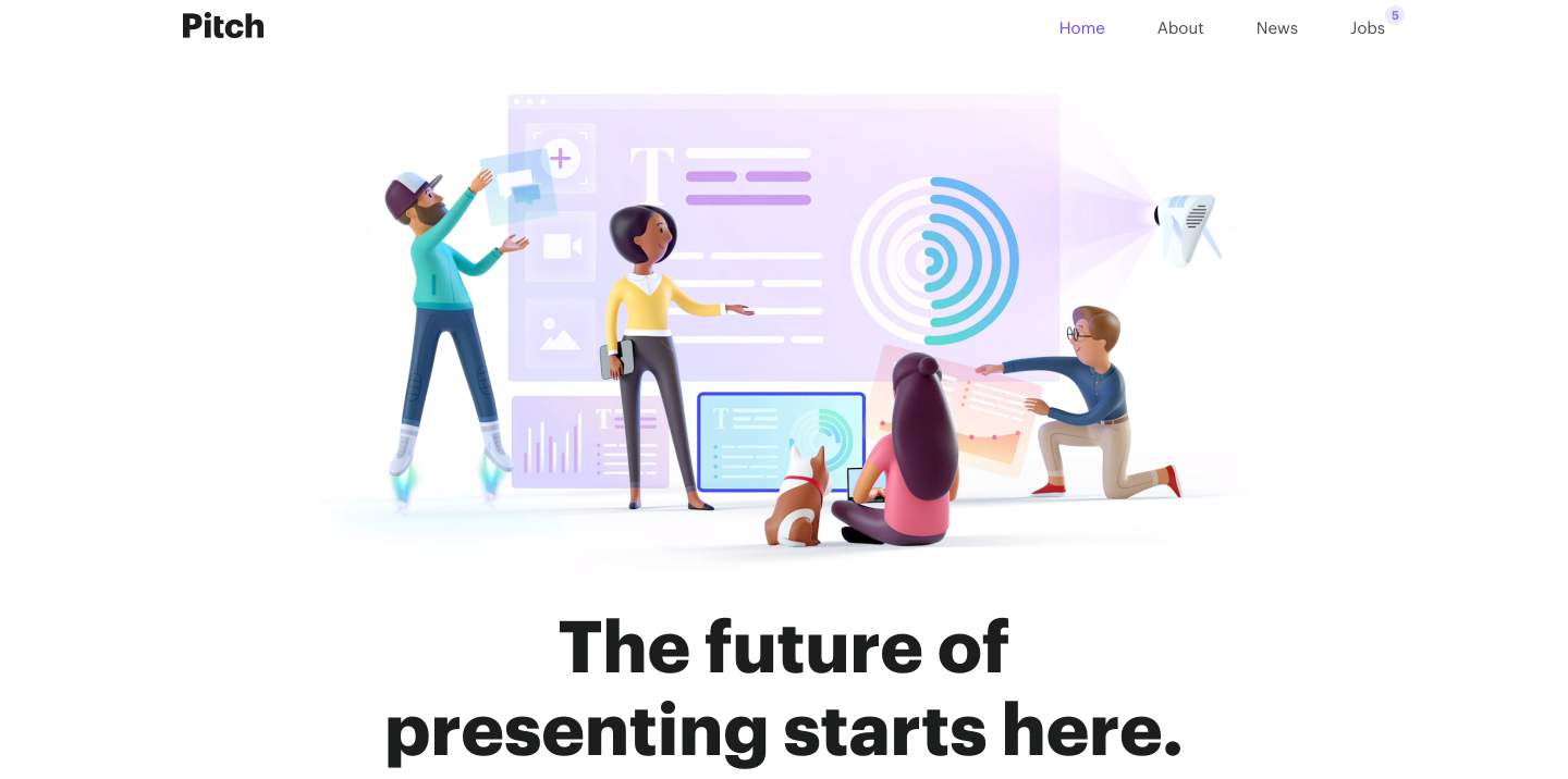
Flat 2.0 creates a mashup of both styles of design. It mixes the simplicity and minimalist approach of flat with the depth and nuances of 3D. This creates an image that is complex but is visually stimulating and never fails to pique interest.

via Dribble
It’s like virtual reality, except you don’t need special equipment to view.
Some people are starting to call this new trend “deep flat”. But if you look at it in a deeper sense, it feels like a natural evolution to the flat style. It breathes new life the minimalist flat style and adds a sense of playfulness to the otherwise “rigid” realism we have come to know.
3. Broken grid and asymmetrical web layouts
In design, grids are just a mix of vertical and horizontal lines used to align various design elements. They are imaginary planes that help layout different elements on the page or screen. But the concept of grids are more than just that – they bring order to an otherwise chaotic field of web elements on a page. For most websites, this grid is easier to point out. Choose different areas that align and the grid becomes apparent.
But things are starting to become different. Current web design trends suggest that more and more websites are leaning more towards broken grids and asymmetric designs. When you have a broken grid, items are pushed around on the plane, making them feel less rigid or broken.
Doing away with symmetry and embracing the chaos of broken grids is an emerging web design trend that is sure to pick up momentum in 2019.
4. Greater focus on mobile
One of the biggest web design trends in 2019 is brands leaning toward optimizing their site for mobile. That is because 4.68 billion users are already on mobile worldwide. So it shouldn’t really come as a surprise that 52% of all website traffic was generated through mobile users in 2018.
As if you need even more evidence, but Google already rolled out its mobile-first indexing in 2018. This new indexing scheme was enacted to prioritize content and links from mobile website pages. As it carries over to 2019, brands will have no choice but to design their websites with a mobile mindset and prioritize creating websites that are mobile-ready.
5. Brands are switching from playful to serious
There’s a big trend looming in 2019 – and it’s a serious one.

via Source
In a totally expected turn of events, several brands have chosen to undergo a reimagining of their brands in favor of a more serious look. They’ve shed their playful personas in exchange for something more sophisticated. Some choose to look at it as a sort of rebranding. I see it as an evolution – letting go of the past and embracing the future.
Of course, other perspectives may also be true. As brands undergo these changes, they may feel as if they have become more mature. Yet, they all seem to fit in the same corporate mold. Still, it is exciting to see more brands embracing this trend of rebranding in the coming years.
6. Improved interaction with micro-animations
Micro-interactions, as the name implies, are small events within a web page that make the user experience much more satisfying. These are provided by micro-animations that support the user’s activities by providing visual and auditory feedback. These can be in the form of a beep, a red dot over an unread message, or a mini-vibration.
There have been many common uses for micro-interactions. However, top design trends dictate that more websites will heavily feature more micro-interactions in 2019. These can be added as hover and scrolling animations, soft sound effects, or text highlighting, and much more. Adding micro-animations keep your audience involved with your website.
While these micro-animations can help improve the user experience, their integration in the UI can be tricky. That is because micro-interactions need to be noticeable enough for users to enhance their interactions with your site. Yet, they also need to be small enough to not seem distracting.
But as a general rule, treat each animation as a heading – you can add one as long as there’s a need for it and should be used to signal the importance of an element.
7. Minimalism

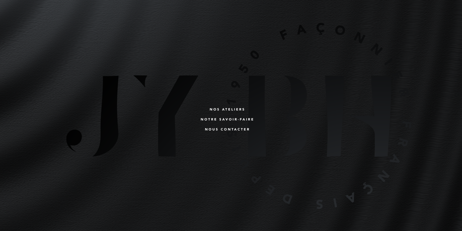
via JY BH
Minimalism is a timeless technique in web design and is easy to know why. It involves a few elements, making the design process easier while also improving the use of negative space, increasing visual appeal.
Minimalism has always been a go-to aesthetic of choice for various brands – 2019 is no exception. People generally enjoy minimalistic websites because the fewer elements involved, the less they have to think – and that’s a good thing. A website designed the right way will surely give what the audience they are looking for – and more.
DragDorp is the only editor universal to any CMS – Magento, Shopify, Lightspeed, WordPress, and others.
It can be used with any HTML editor to help you build pages visually.
It comes with 75+ ready Landing page templates you can use on any CMS!
Try it now for free, register here and publish your slideshow today 🙂


Leave a Reply
Want to join the discussion?Feel free to contribute!